Modern Retail Design: The Reveal
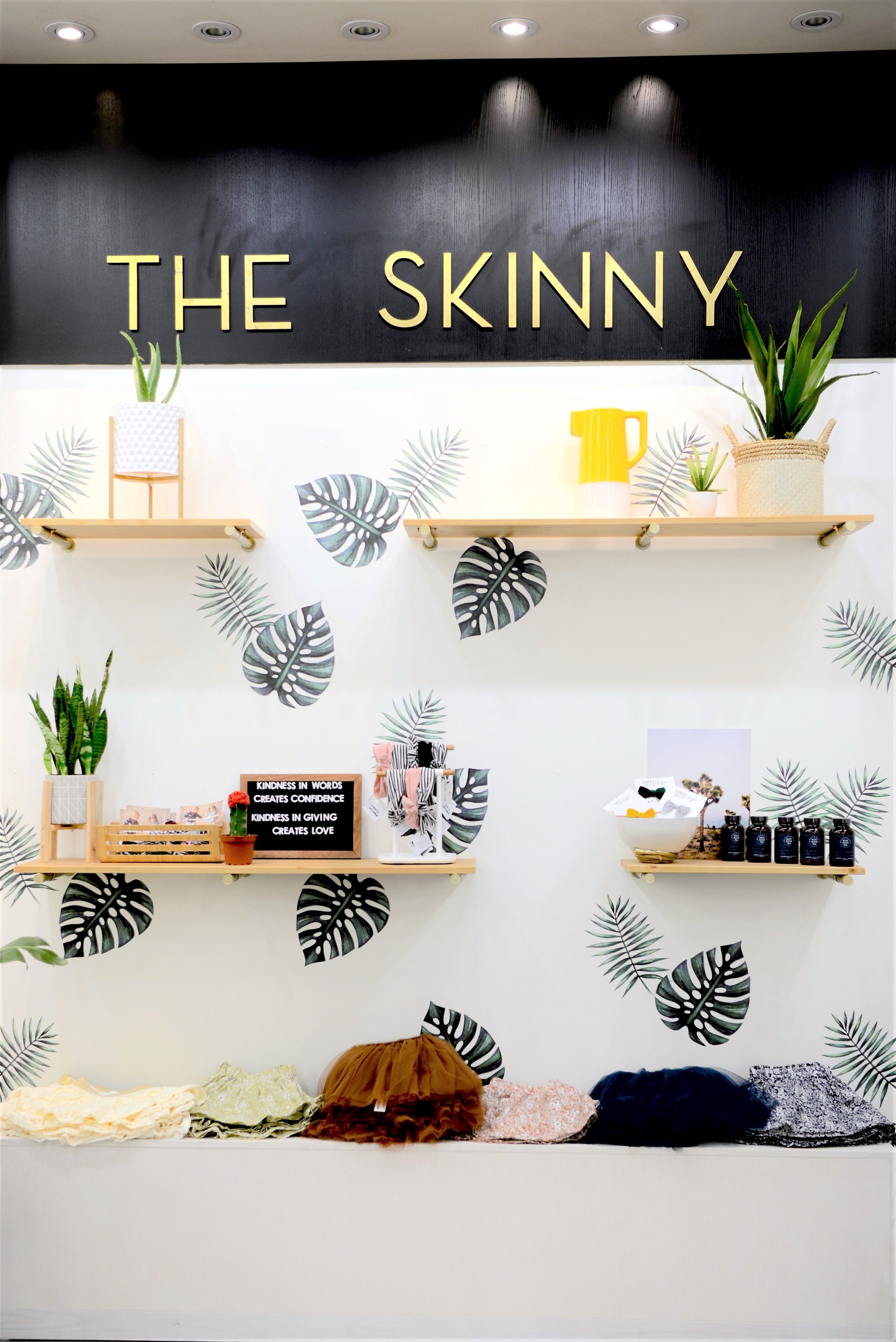
Last week I shared the design plan for Shop The Skinny's new location in Kingsway Mall. With a bit of help from the Brick we chose some great pieces and design elements to pull together a modern space that's as functional as it is stylish and today, I'm showing off the finished space...
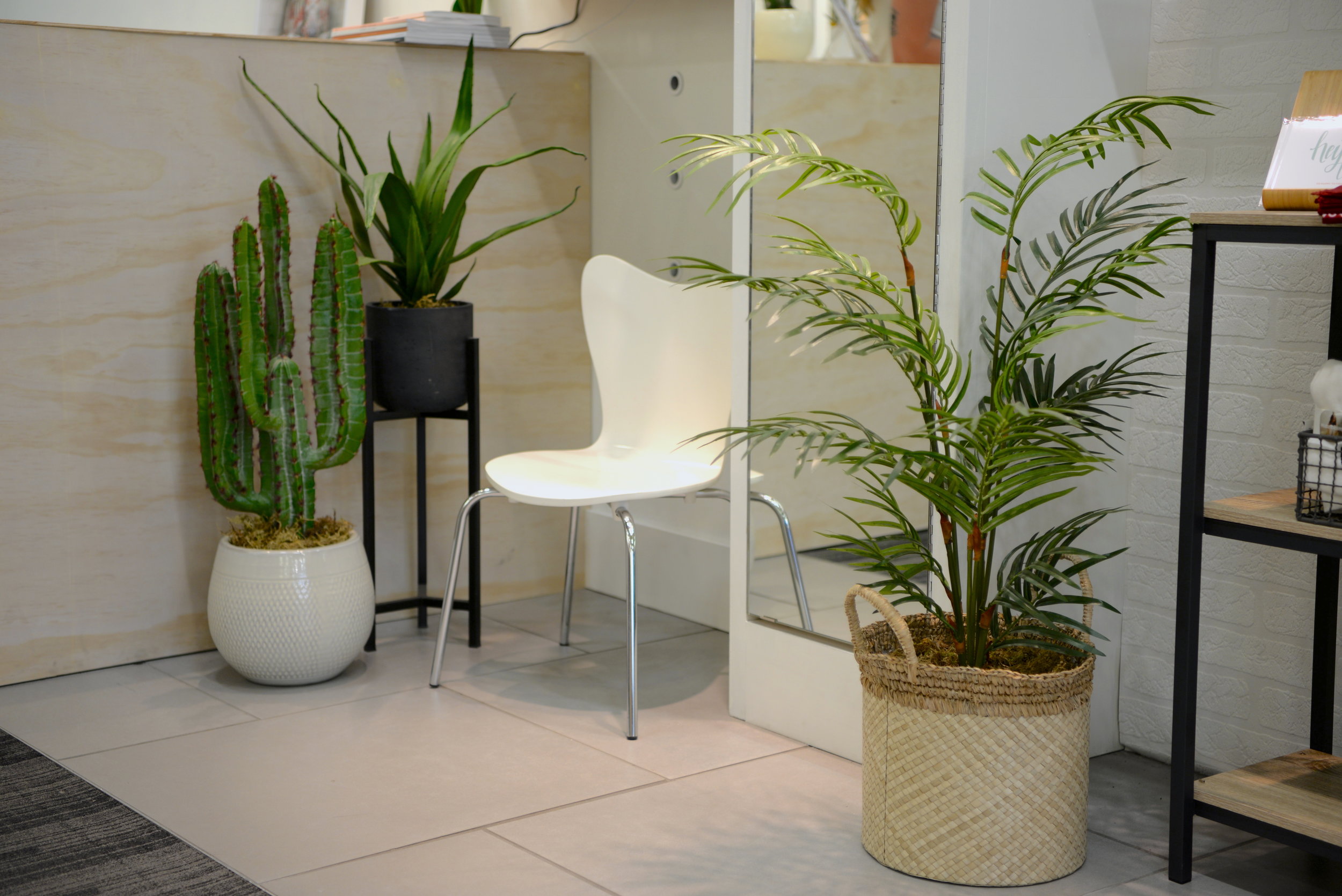
You might remember we started with a very grey and very empty space. The main goal of the design plan was to create a space that would be functional with lots of layered storage and display options for Shop The Skinny's great clothing and other items. Secondary to the function of the space was the style. Modern, minimalist, eclectic and juxtaposing natural elements with pops of metal, the overall look is cozy, eclectic and stylish.
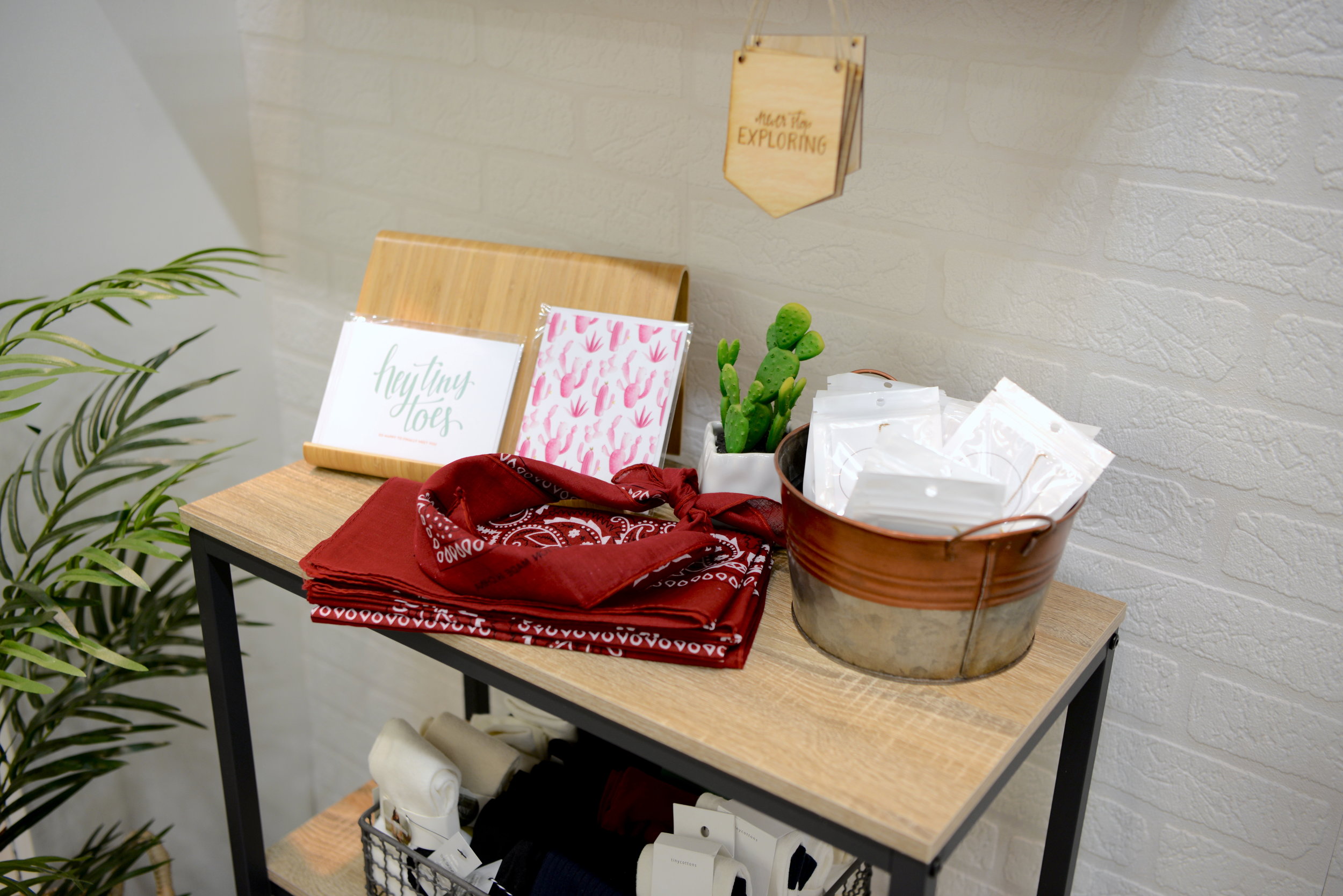
The Peyton counter height table was the perfect piece for displaying tees at the front of the store. The mid tone wood is a great contrast to the lighter woods seen elsewhere and the industrial vibe was just right for the space. The other pieces we scored were from the North Avenue collection and with their clean lines, light wood and simple design they were just right for adding stylish storage for the shop. Our last accent from the Brick is the oh so stylish malpas accent table. I've got my eyes on this one, I love it! The perfect accent piece.
Take a look at the finished space below - what do you think of the eclectic design?
Sources: Square Side Tables // Console Table // 3 Tier Shelf/TV Stand // Small Shelves // Front Counter Height Table // Bar Cart // Glass and Wood Side Table // Wall Decals // Paint Color - Benjamin Moore Chantilly Lace - If you're looking for sources on anything else let me know in the comments below!


