Introducing: #TheDuchessOnTheDrive
Hello friends and happy new year! I have been enjoying a much needed break from the blog and social media over the past few weeks and I’m starting this year feeling well rested, inspired and excited for the year ahead. Today I’m thrilled to announce that another Kresswell Interiors project is ready to share!
The majority of the design work I’ve done both on my own and with Kresswell never sees the light of day; the stars kind of have to align to get a project to a place where it’s photo ready. The clients have to be comfortable having their home photographed, the project needs to be fully finalized in a reasonable timeframe and it has to be a job that we get excited about and want to share. This project, is definitely one of those.
Kristina and I began working on this project last year and as soon as we met with these clients we knew they’d be a great fit for us both style wise but also, to be able to document the process and share! We’ve already been teasing this project a bit on our IG stories and even sharing a glimpse at the GORGEOUS wallpaper we used in the laundry room but today, we can finally share the full reveal and we are SO excited!
THE BEFORE
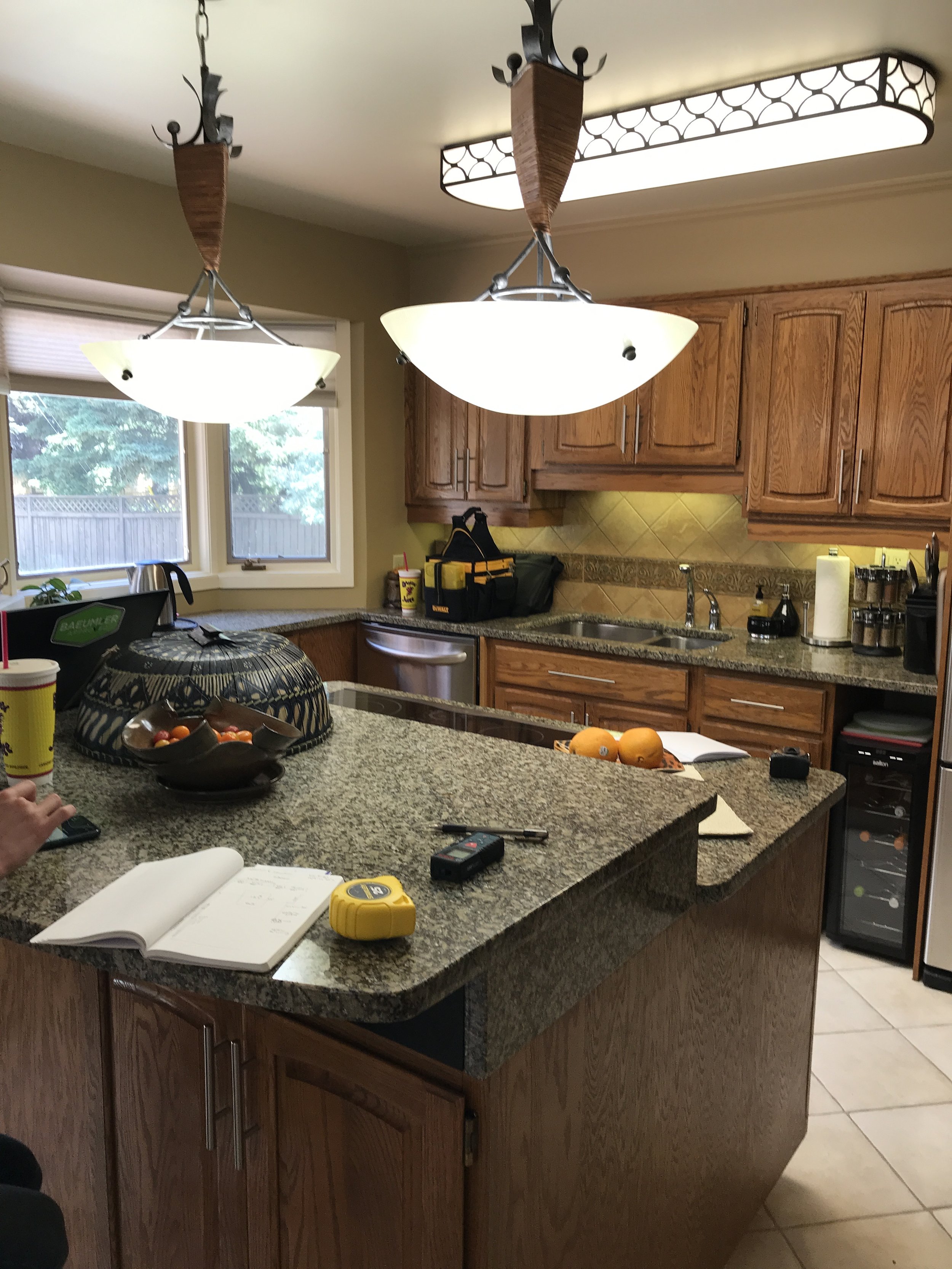
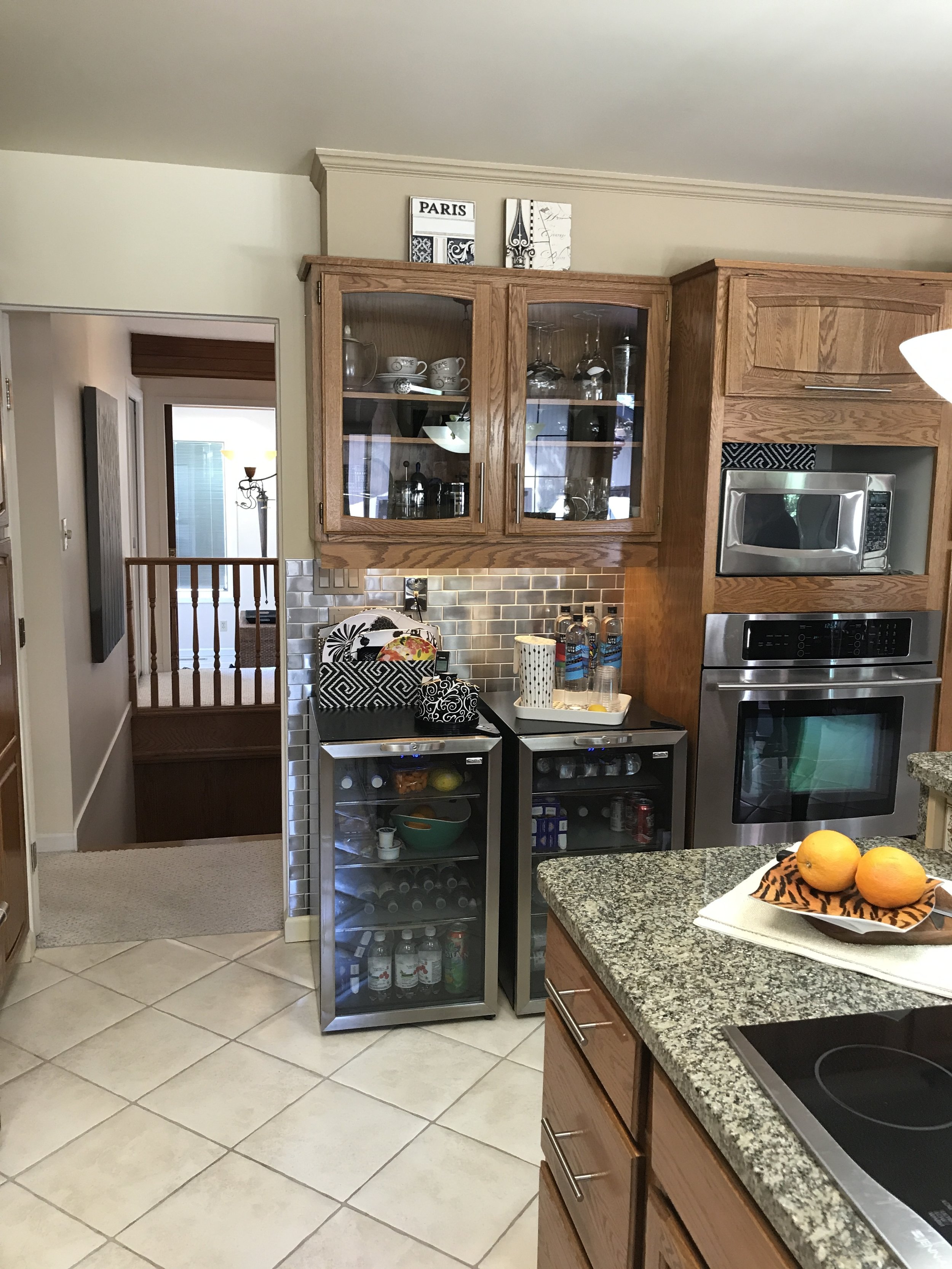
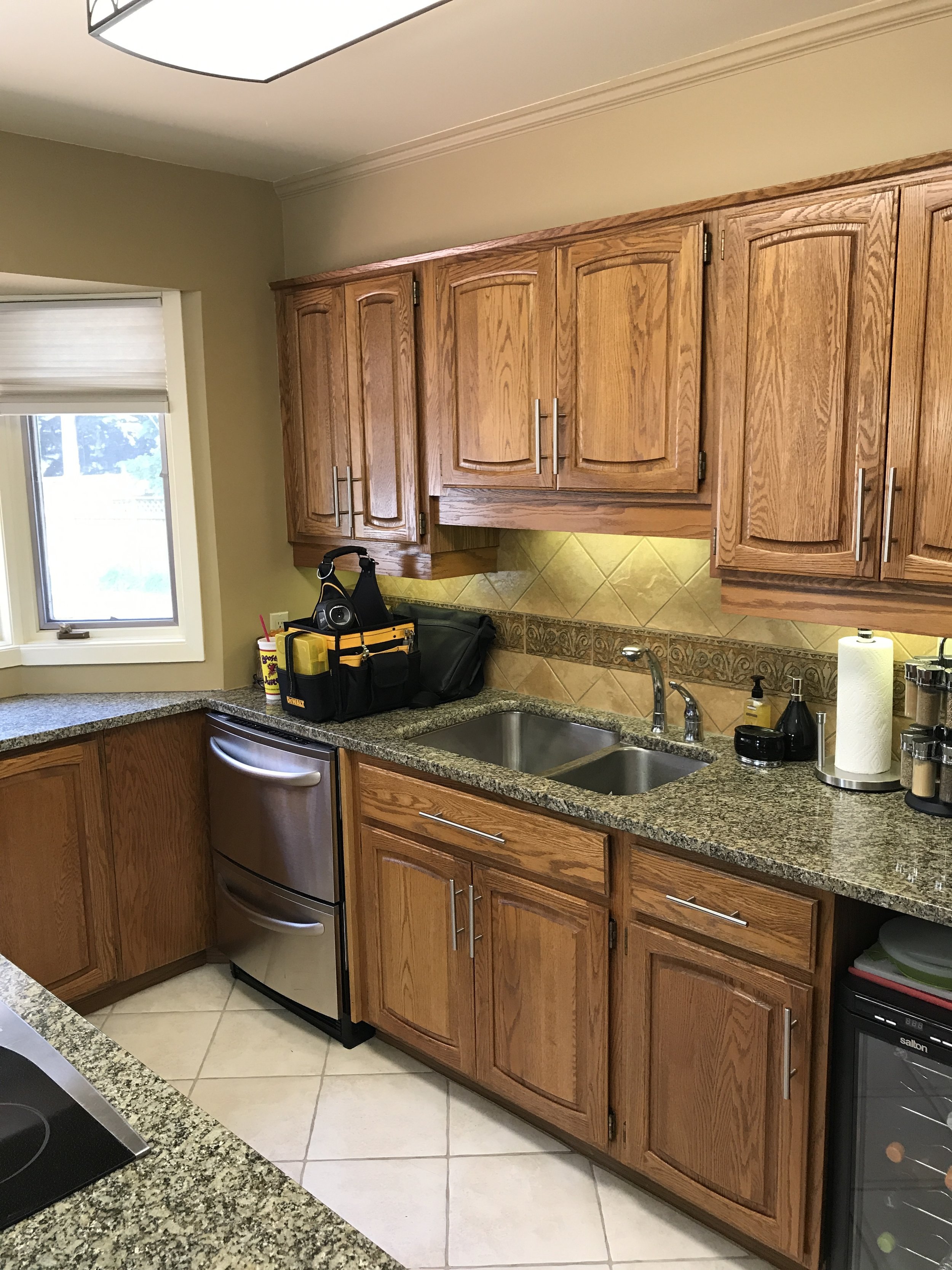
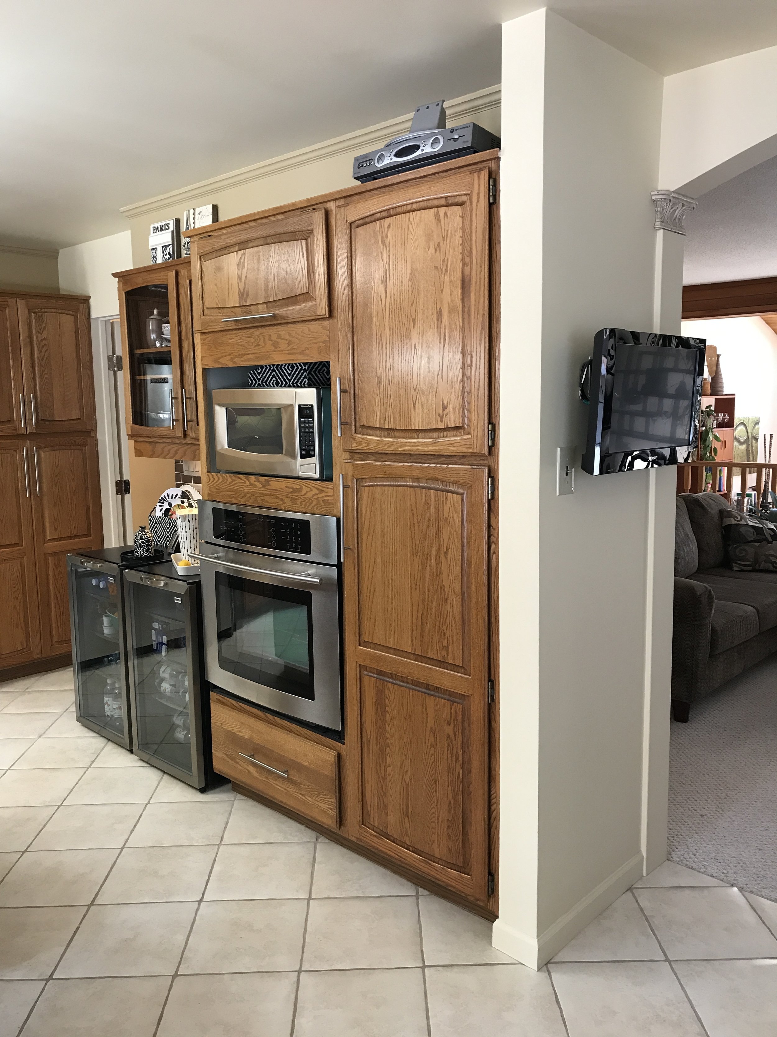
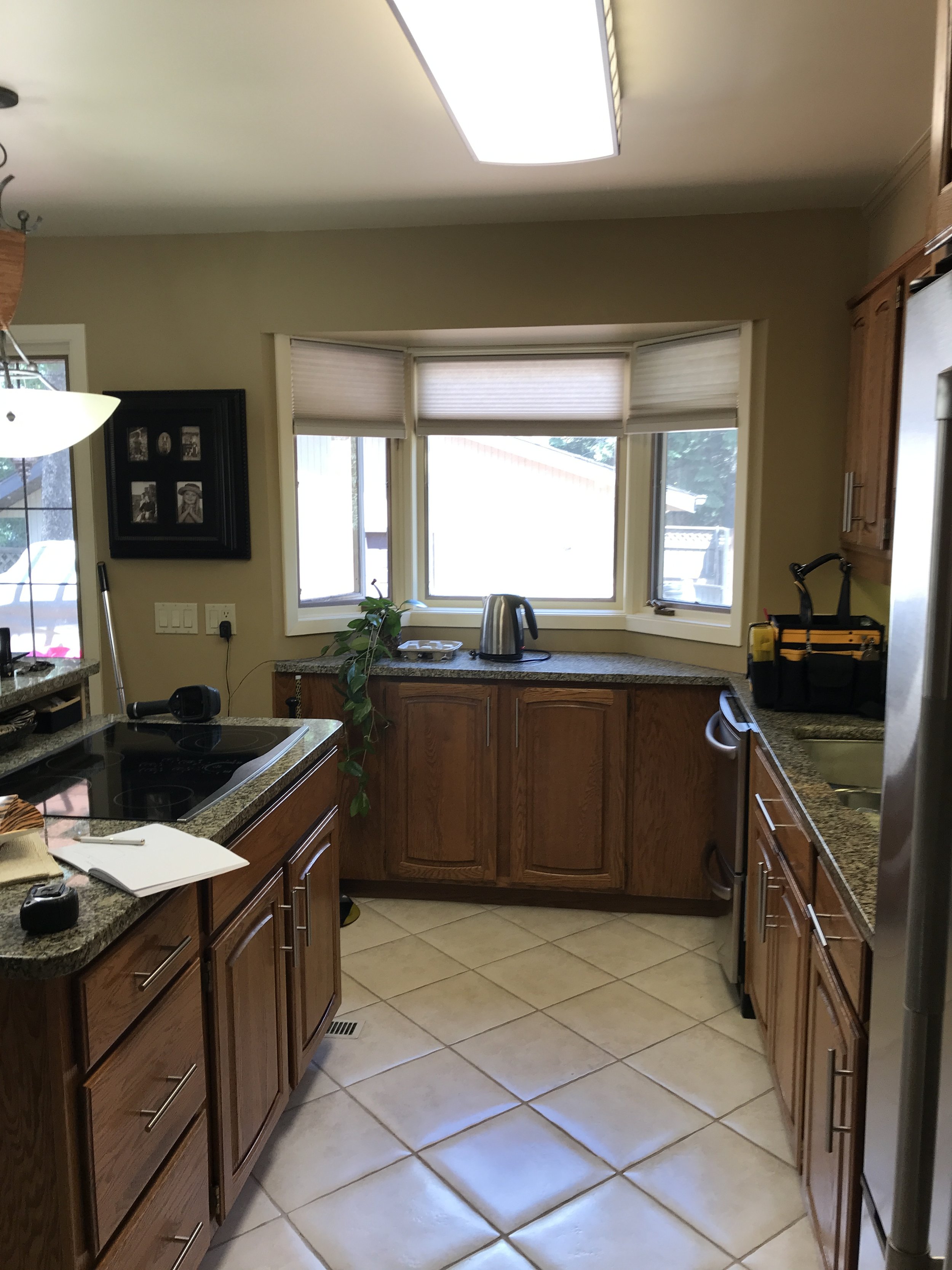
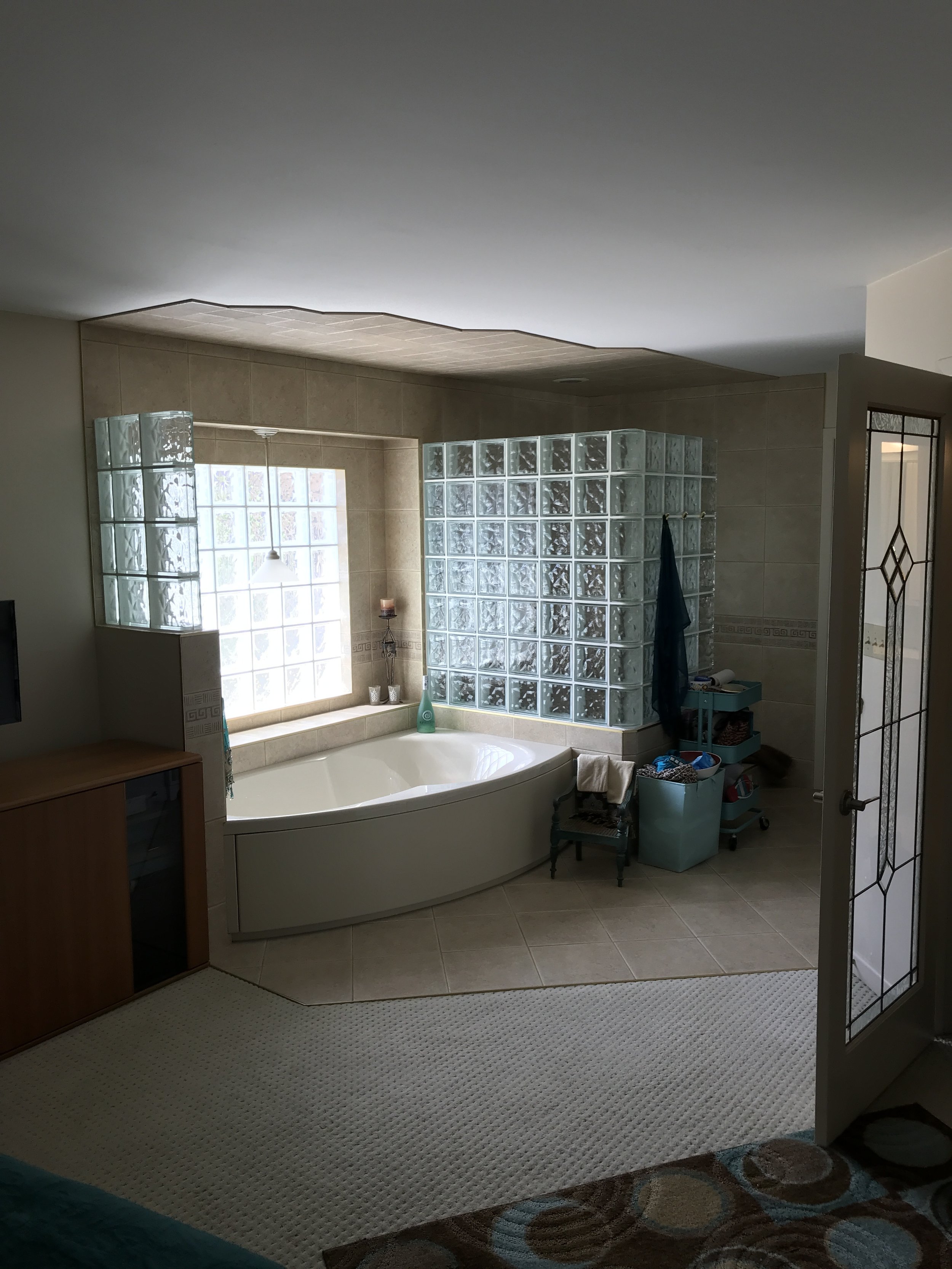
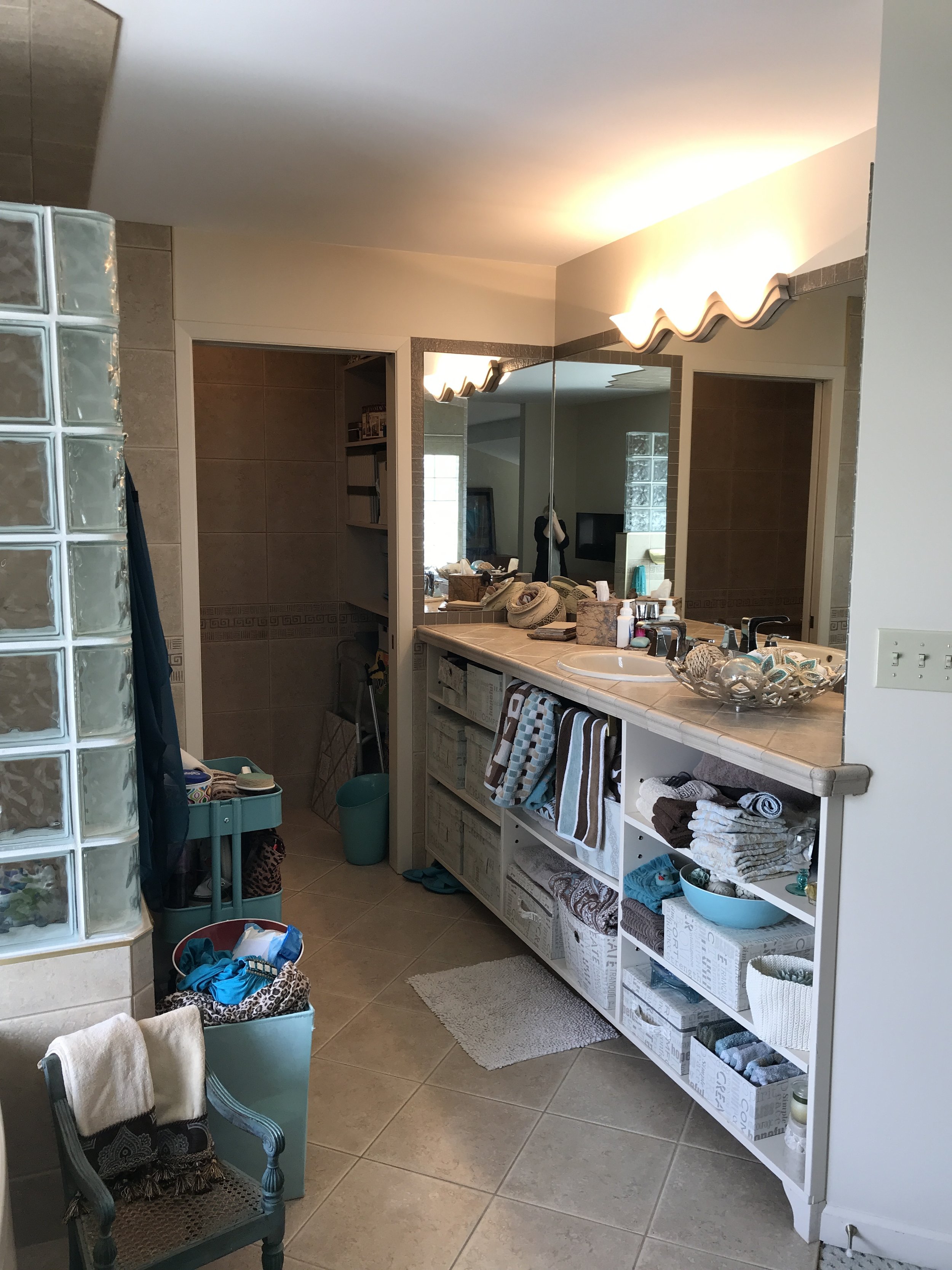
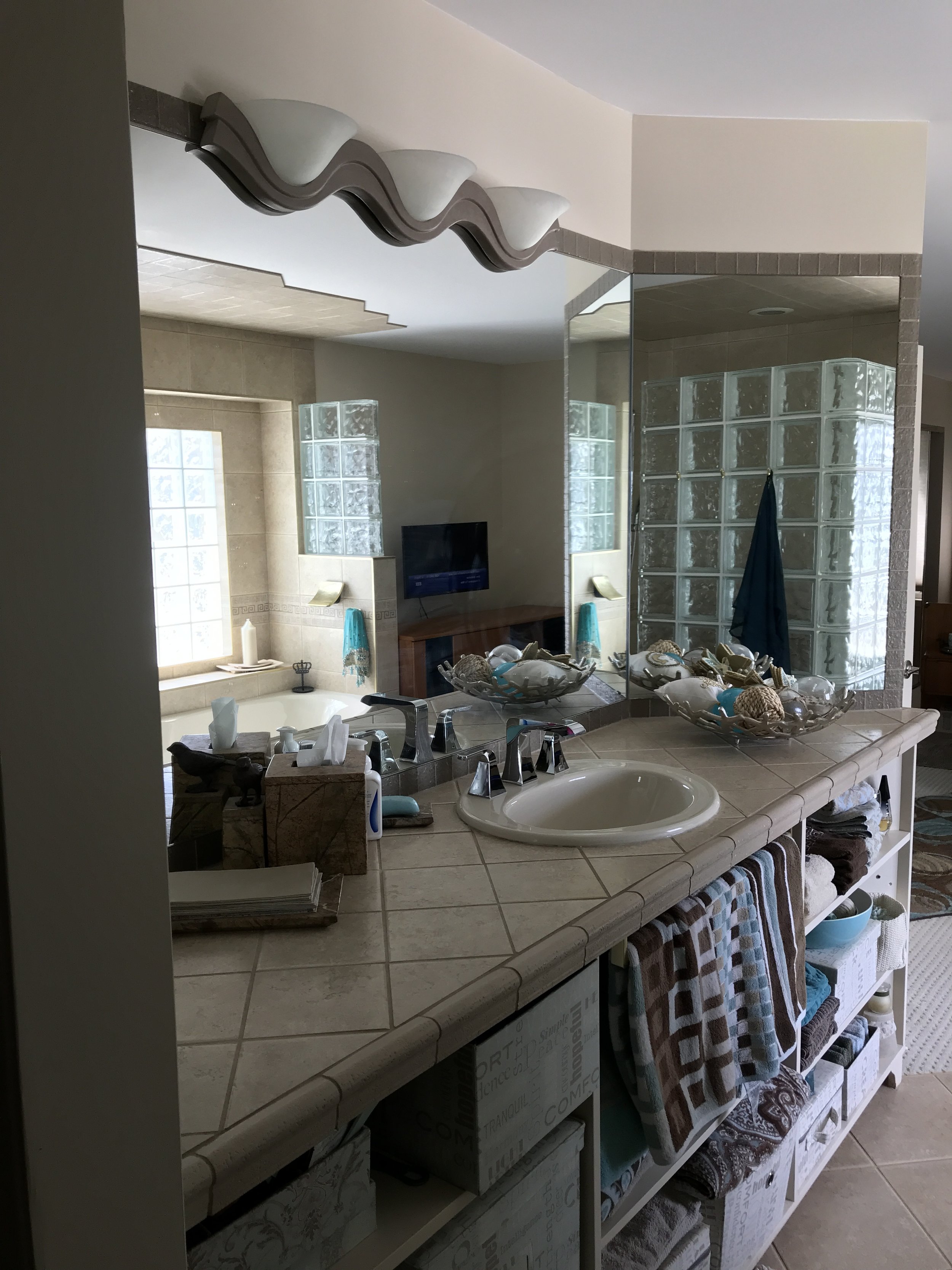
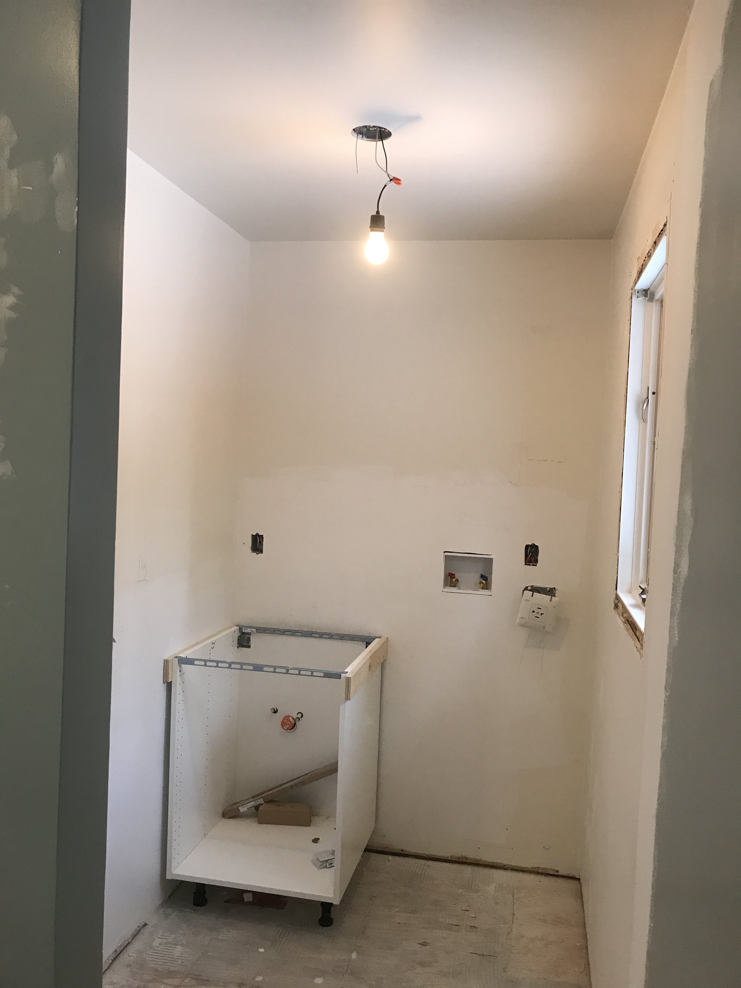
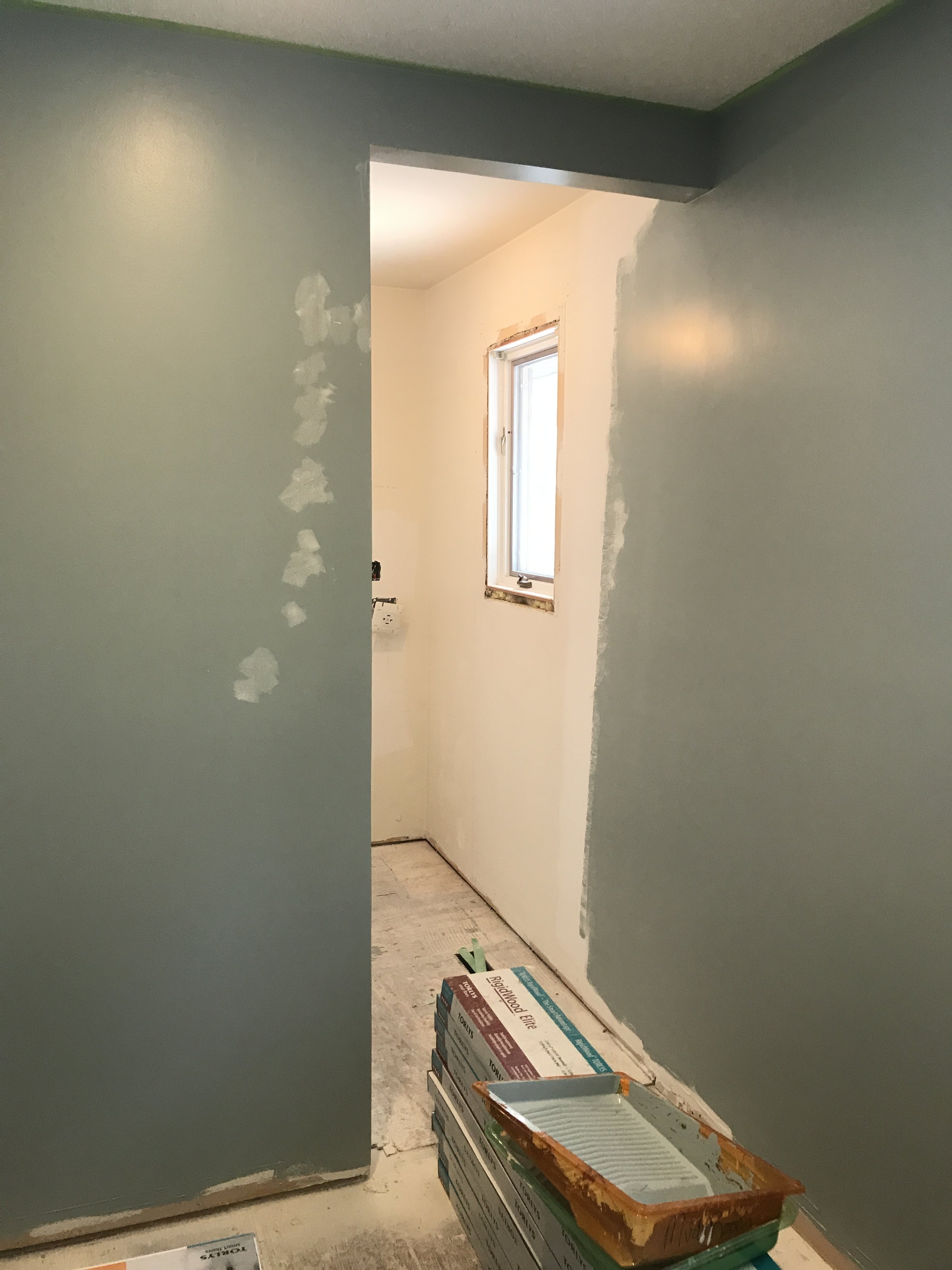
Our clients purchased #TheDuchessOnTheDrive and had Revive Developments and ourselves get to work before they even moved in. The home is in a beautiful neighbourhood and our clients have fabulous style, hence - the duchess moniker. This couple’s new to them home is beautiful with great bones and character but it was a wee bit dated. The finishes were out of style and a few areas weren’t functioning as well as they could so we stepped in to make some major changes. Just take a look for yourself….
THE PLAN
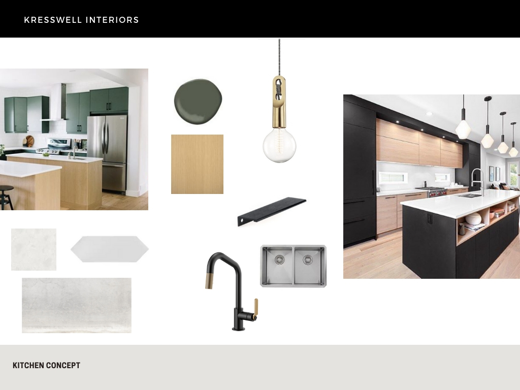
The first space we got working on was the kitchen. Right away we knew that these were clients who we could have a bit of fun with! They were open to bringing in a bit of drama with either black or green cabinetry for a unique look. Flat panel millwork, minimalist pulls, black fixtures and small pops of brass were a part of our modern kitchen plan as was making the kitchen cabinetry and layout way more functional! Just take a peek at our very first rough concept that helped us finalize our decisions.
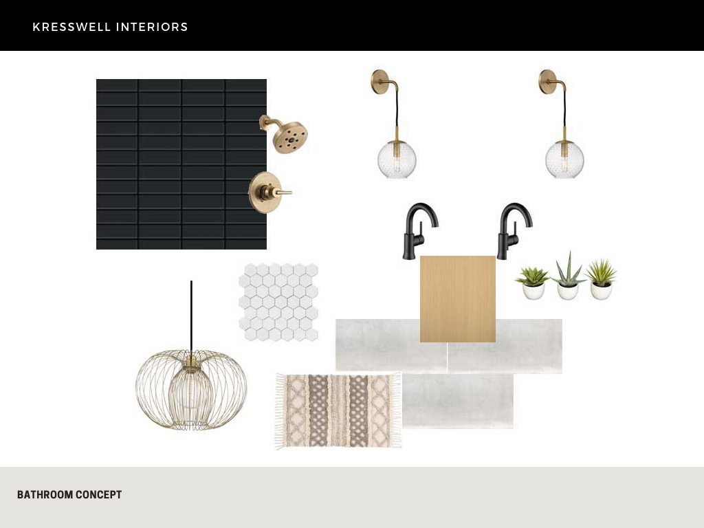
The next space to tackle was the master ensuite. This washroom was very dated and a bit too open concept for both aesthetic and practical purposes. After a bit of back and forth our clients decided to opt for a bit of drama in that room with a modern black shower to anchor the otherwise bright and light room. We love how simple but impactful a modern straight stack subway tile looks and in this space, the results are swoon worthy! We worked within a palette of neutrals using white, gray and black as our main colors and added warmth to the room with a warm oak vanity and pops of greenery. Just wait until you see the lighting in this room! Here’s the rough initial inspiration for the space…
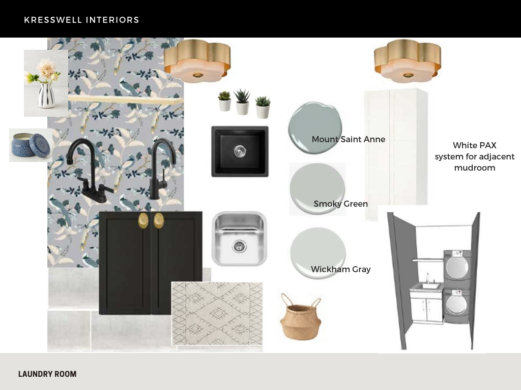
Last but certainly not least - we tackled the laundry room. This whole back entryway and laundry space was completely reconfigured from it’s original state to be more functional for the homeowners. The laundry room itself was pretty tight and initially, we didn’t have anything too dramatic planned for the area but when our clients mentioned they’d be open to wallpapering the whole space - we could not WAIT to source some fun wallpaper. After showing a few options, we all fell in love with the beautiful paper that you see below and decided to bring a bit of color to the otherwise white walls throughout the house into the mudroom. A few glamorous brass accents complete the room and changed what could have been a very simple laundry space into a major statement space!
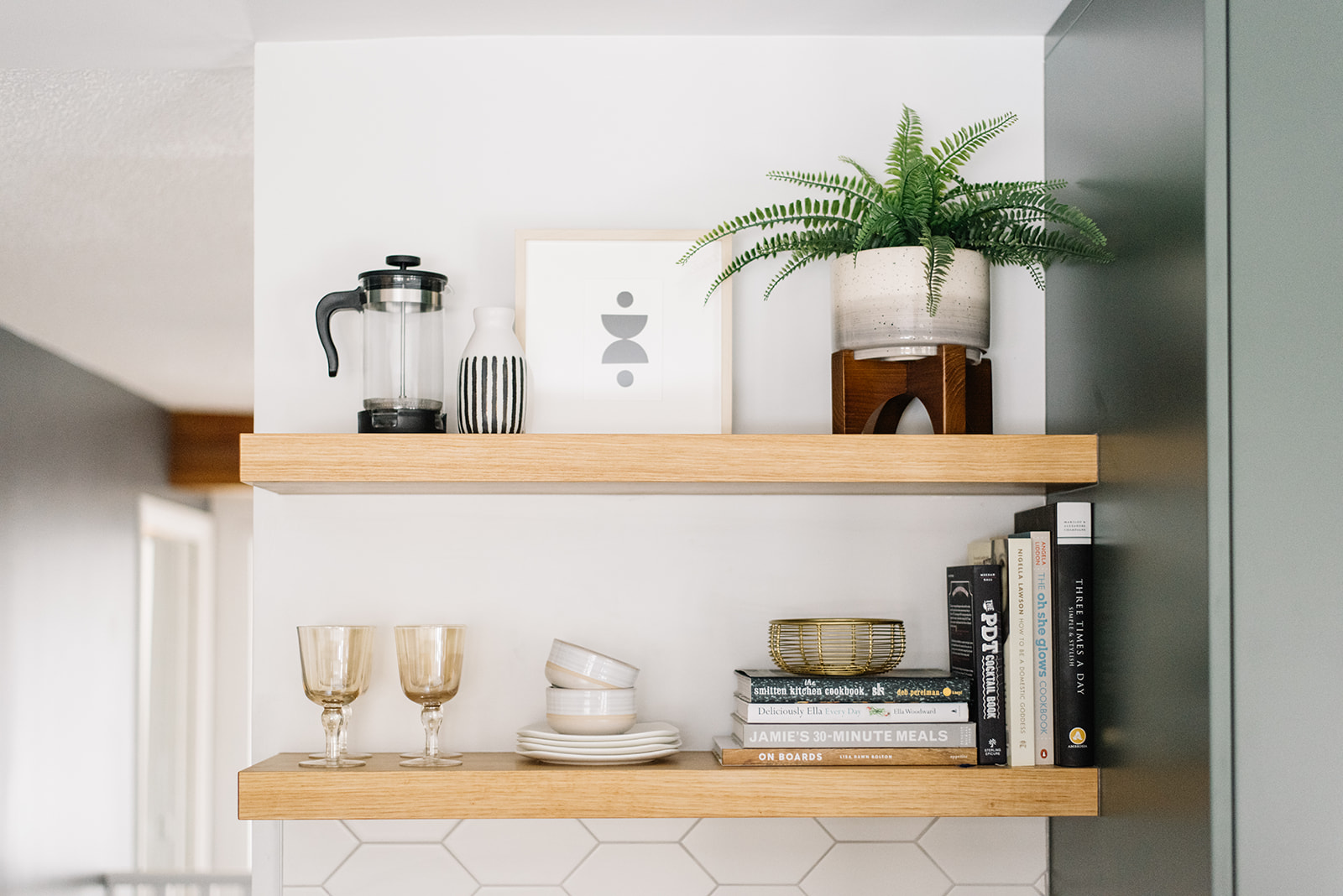
Okay - so now with the ‘before’ images and the inspiration for each space shared, it’s now time to see these rooms revealed! Trust me, just look at this little peek of the kitchen - you’ll want to see this reveal! Head over to the Kresswell Interiors website for all of the gorgeous ‘After’ images and more information on the project!
Here’s to starting 2019 on a beautiful note!!
